For any industry, the amount of analytical data increases by nearly 30% percent every year. Visualizing data in terms of trends, patterns and predictions has become much more complex for business and sales managers across industries.
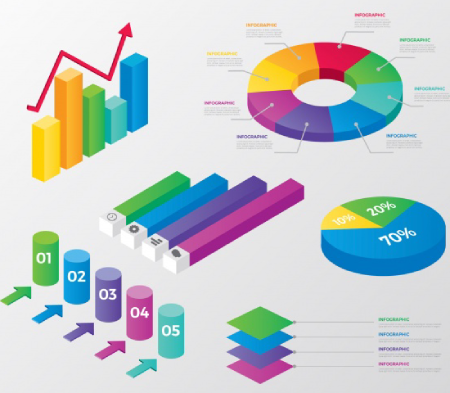
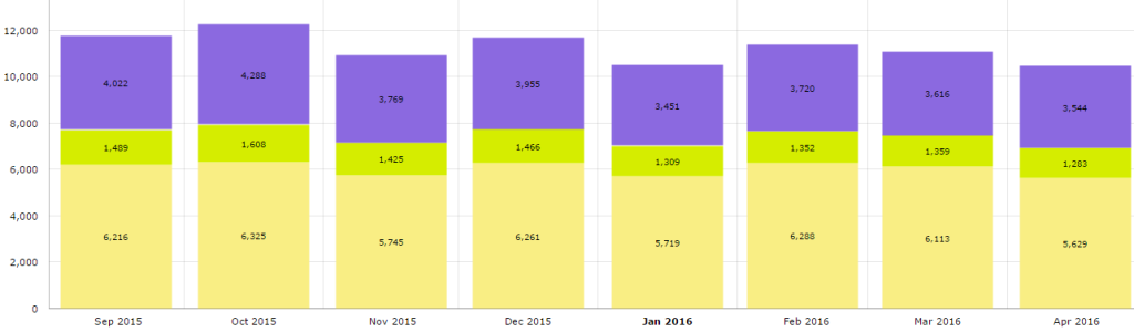
Here’s where “Data Visualization” comes to the rescue. Data visualization by Histograms, Bar Charts, Fusion Charts, Funnel Charts and Line Graphs are a simple yet efficient way for data review. A picture is worth thousand words!!.
Representing data in charts is more efficient, self-explanatory and storytelling when compared to spread sheets.
A charting tool at service is a great asset for people who attend meetings, review performance by numbers.
Data Visualization is more important for any business today. It makes the employees and the employers to identify the patterns and trends immediately and raise questions based on their area of expertise.
Data Visualization and Benefits
- Simply the process of analyzing data sets.
- Enables business users to analyze the data without depending on IT.
- Get a historical view of data and descriptive analysis.
- Helps to quickly spot the emerging trends, sales patterns and customer behavior.